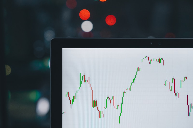
Candlestick Chart
Quick Answer
A chart type displaying the open, high, low, and close prices for each time period as a 'candle' shape.
Anatomy of a Candlestick
Each candlestick represents price action for a specific time period and shows four key data points:
Open - The first traded price of the period High - The highest price reached during the period Low - The lowest price reached during the period Close - The last traded price of the period
The thick part (body) shows the range between open and close. The thin lines (wicks/shadows) show the high and low.
Reading Colors
Note
Warning
Common Patterns
Doji - Open and close are nearly equal, showing indecision Hammer - Small body at top with long lower wick, bullish reversal signal Shooting Star - Small body at bottom with long upper wick, bearish reversal signal Engulfing - Large candle that completely covers the previous candle's body
Pro Tip
Real-World Example
A large bullish engulfing candlestick pattern at a support level often signals strong buying pressure and potential trend reversal.